ESPUI
ESPUI is a simple library to make a web user interface for your projects using the ESP8266 or the ESP32 It uses web sockets and lets you create, control, and update elements on your GUI through multiple devices like phones and tablets.
ESPUI uses simple Arduino-style syntax for creating a solid, functioning user interface without too much boilerplate code.
So if you either don't know how or just don't want to waste time: this is your simple solution user interface without the need of internet connectivity or any additional servers.
The Library runs fine on any kind of ESP8266 and ESP32 (NodeMCU Boards, usw)
Changelog for 2.0:
- ArduinoJSON 6.10.0 Support
- split pad into pad and padWithCenter
- Cleaned Order or parameters on switch
- cleaned Order of parameters on pad
- Changes all numbers to actually be numbers (slider value, number value, min and max)
Added features
- Tabs by @eringerli #45
- Generic API by @eringerli
- Min Max on slider by @eringerli
- OptionList by @eringerli
- Public Access to ESPAsyncServer
- Graph Widget (Persist save graph in local storage #10)
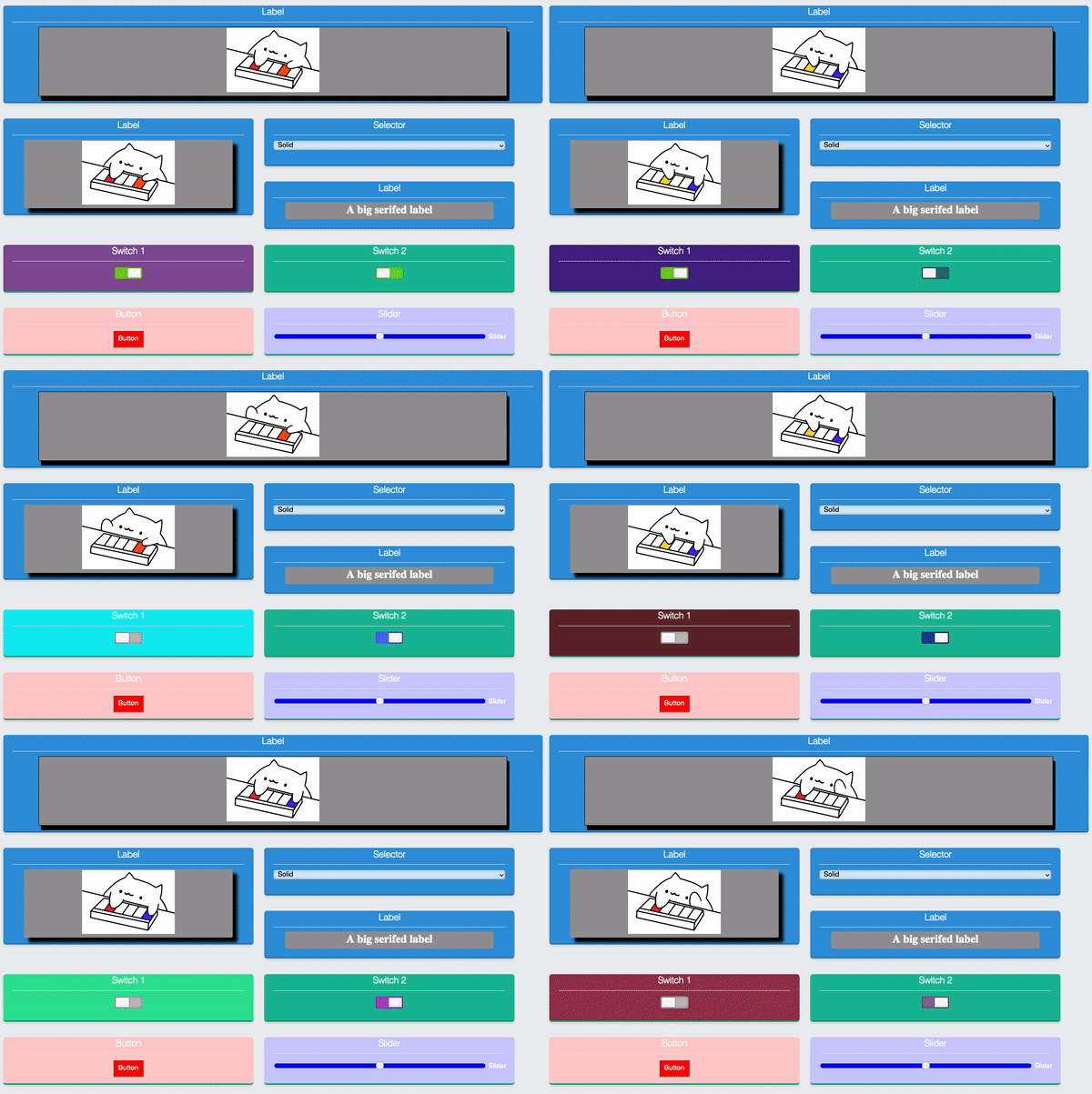
- Inline CSS styles by @iangray001
- Separators by @iangray001
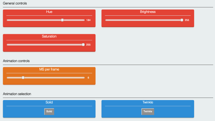
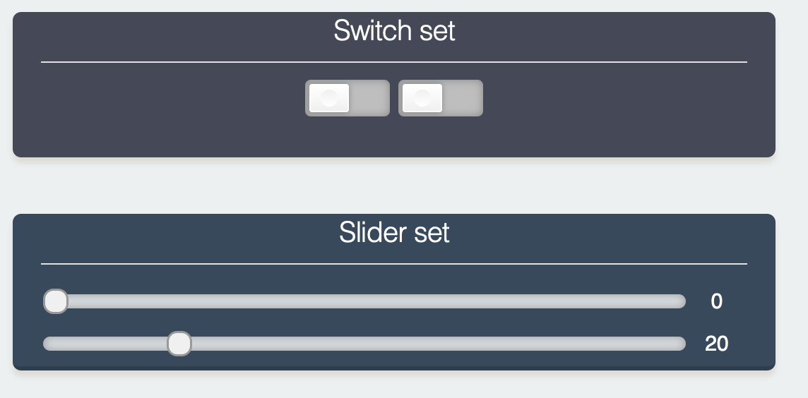
- Grouped and wide controls by @iangray001
Further Roadmap
- Slider css issues
- implement Gauge
- File upload ?
Dependencies
This library is dependent on the following libraries to function properly.
-
ArduinoJson (Last tested with version 6.10.0)
-
(For ESP8266) ESPAsyncTCP
-
(For ESP32) AsyncTCP
How to Install
Make sure all the dependencies are installed, then install like so:
Using PlattformIO (recommended)
Just include this library as a dependency on lib_deps like so:
lib_deps =
    ESPUI
    ESPAsyncWebserver
    ESPAsyncTCP # or AsyncTCP on ESP32
Directly Through Arduino IDE (recommended)
You can find this Library in the Arduino IDE library manager Go to Sketch > Include Library > Library Manager > Search for "ESPUI" > Install
Manual Install Arduino IDE
For Windows: Download the Repository and extract the .zip in Documents>Arduino>Libraries>{Place "ESPUI" folder Here}
For Linux: Download the Repository and extract the .zip in Sketchbook/Libraries/{Place "ESPUI" folder Here}
For macOs: Download the Repository and extract the .zip in ~/Documents/Arduino/libraries/{Place "ESPUI" folder Here}
Go to Sketch>Include Library>Add .zip Library> Select the Downloaded .zip File.
Getting started
ESPUI serves several files to the browser to build up its web interface. This can be achieved in 2 ways: PROGMEM or SPIFFS
When ESPUI.begin() is called the default is serving files from Memory and
ESPUI should work out of the box!
OPTIONAL: But if this causes your program to use too much memory you can
burn the files into the SPIFFS filesystem on the ESP. There are now two ways to
do this: you can either use the ESP file upload tool or you use the library
function ESPUI.prepareFileSystem()
Simple filesystem preparation (recommended)
Just open the example sketch prepareFileSystem and run it on the ESP, (give
it up to 30 seconds, you can see the status on the Serial Monitor), The library
will create all needed files. Congratulations, you are done, from now on you
just need to do this again when there is a library update, or when you want to
use another chip :-) Now you can upload your normal sketch, when you do not call
the ESPUI.prepareFileSystem() function the compiler will strip out all the
unnecessary strings that are already saved in the chip's filesystem and you have
more program memory to work with.
User interface Elements
- Label
- Button
- Switch
- Control pad
- Control pad with center button
- Slider
- Text Input
- Numberinput
- Graph
- Option select
Checkout the example for the usage or see the detailed info below
Available colors:
- Turquoise
- Emerald
- Peterriver
- Wetasphalt
- Sunflower
- Carrot
- Alizarin
- Dark
- None
(Use like ControlColor::Sunflower)
Documentation
The heart of ESPUI is ESPAsyncWebserver. ESPUI's frontend is based on Skeleton CSS and jQuery-like lightweight zepto.js for Handling Click Events Etc. The communication between the ESP and the client browser works using web sockets. ESPUI does not need network access and can be used in standalone access point mode, all resources are loaded directly from the ESPs memory.
This section will explain in detail how the Library is to be used from the
Arduino code side. In the arduino setup() routine the interface can be customised by adding UI Elements.
This is done by calling the corresponding library methods on the Library object
ESPUI. Eg: ESPUI.button("button", &myCallback); creates a button in the
interface that calls the myCallback(Control *sender, int value) function when changed. All buttons and
items call their callback whenever there is a state change from them. This means
the button will call the callback when it is pressed and also again when it is
released. To separate different events an integer number with the event name is
passed to the callback function that can be handled in a switch(){}case{}
statement. Here is an overview of the currently implemented different elements
of the UI library:
Button
Buttons have a name and a callback value. They have one event for press (B_DOWN) and one
for release (B_UP).
- B_DOWN
- B_UP
Switch
Switches sync their state on all connected devices. This means when you change
their value they change visibly on all tablets or computers that currently
display the interface. They also have two types of events: one when turning on (S_ACTIVE)
and one when turning off (S_INACTIVE).
- S_ACTIVE
- S_INACTIVE
Buttonpad
Button pads come in two flavours: with or without a center button. They are very useful for con-trolling all kinds of movements of vehicles or also of course our walking robots. They use a single callback per pad and have 8 or 10 different event types to differentiate the button actions.
- P_LEFT_DOWN
- P_LEFT_UP
- P_RIGHT_DOWN
- P_RIGHT_UP
- P_FOR_DOWN
- P_FOR_UP
- P_BACK_DOWN
- P_BACK_UP
- P_CENTER_DOWN
- P_CENTER_UP
Labels
Labels are a nice tool to get information from the robot to the user interface.
This can be done to show states, values of sensors and configuration parameters.
To send data from the code use ESP.print(labelId, "Text"); . Labels get a name
on creation and a initial value. The name is not changeable once the UI
initialised.
Labels automatically wrap your text. If you want them to have multiple lines use
the normal <br> tag in the string you print to the label.
In fact, because HTML can be used in the label's value, you can make a label display
images by including an <img> tag.
ESPUI.label("An Image Label", ControlColor::Peterriver, "<img src='path/to/image'>");
This requires that the client has access to the image in question, either from the internet or a local web server.
Slider
The Slider can be used to slide through a value from 1 to 100. Slides provide realtime data, are touch compatible and can be used to for example control a Servo. The current value is shown while the slider is dragged in a little bubble over the handle. In the Callback the slider does not return an int but a String. Use the .toInt function to convert the value, see the gui example to check how it works.
A slider usually only sends a new value when it is released to save the esps from being spammed with values. This behaviour can be cahnged globally using a property of the ESPUI object before begin():
  ESPUI.sliderContinuous = true;
  ESPUI.begin("ESPUI Control");
Number Input
The numberinput can be used to directly input numbers to your program. You can enter a Value into it and when you are done with your change it is sent to the ESP.
A number box needs to have a min and a max value. To set it up just use:
ESPUI.number("Numbertest", &numberCall, ControlColor::Alizarin, 5, 0, 10);
Text Input
The textinput works very similar like the number input but with a string. You can enter a String into it and when you are done with your change it is sent to the ESP.
Graph
The graph widget can display graph points with timestamp at wich they arrive
Use ESPUI.addGraphPoint(graphId, random(1, 50)); to add a new value at the current time, use ESPUI.clearGraph(graphId) to clear the entire graph.
Graph points are saved in the browser in localstorage to be persistant, clear local storageto remove the points or use clearGraph() from a bbutton callback to provide a clear button.
Option select
The option select works by first creating a select widget like so
uint16_t select1 = ESPUI.addControl( ControlType::Select, "Select:", "", ControlColor::Alizarin, tab1, &selectExample );
And then adding Options to it like seperate widgets, specifying the select as the parent:
ESPUI.addControl( ControlType::Option, "Option1", "Opt1", ControlColor::Alizarin, select1 );
ESPUI.addControl( ControlType::Option, "Option2", "Opt2", ControlColor::Alizarin, select1 );
ESPUI.addControl( ControlType::Option, "Option3", "Opt3", ControlColor::Alizarin, select1 );
Check the tabbedGui example for a working demo
Using Tabs
Tabs can be used to organize your widgets in pages. Check the tabbedGui example.
Tabs can be created using the generic functions like so:
ESPUI.addControl( ControlType::Tab, "Settings 1", "Settings 1" );
Then all widgets for the tab need to be added to it by specifying the tab as the parrent (widgets not added to a tab will be shown above the tab selctor)
ESPUI.addControl( ControlType::Text, "Text Title:", "a Text Field", ControlColor::Alizarin, tab1, &textCall );
Separators
You can use separators to break up the UI and better organise your controls. Adding a separator will force any following controls onto the subsequent line. Add separators as follows:
ESPUI.separator("Separator name");
//or
ESPUI.addControl(ControlType::Separator, "Separator name", "", ControlColor::None, maintab);
Initialisation of the UI
After all the elements are configured you can use ESPUI.begin("Some Title");
to start the UI interface. (Or ESPUI.beginSPIFFS("Some Title"); respectively)
Make sure you setup a working network connection or AccesPoint before (See
gui.ino example). The web interface can then be used from multiple devices at once and
also shows an connection status in the top bar.
Advanced: Generic creation and updates of control widgets
There are 2 generic functions to create and update controls, to see them in action check the gui-generic-api example.
To create a generic control use:
uint16_t switchOne = ESPUI.addControl(ControlType::Switcher, "Switch one", "", ControlColor::Alizarin, Control::noParent, &switchExample);
Then its value can be updated by doing:
ESPUI.updateControlValue(status, "Start");
You can also update other parameters of the control like its color using:
    ESPUI.getControl(switchOne)->color = ControlColor::Carrot;
    ESPUI.updateControl(switchOne);
Log output
ESPUI has several different log levels. You can set them using the
ESPUI.setVerbosity(Verbosity::VerboseJSON) function.
Loglevels are:
Verbosity::Quiet(default)Verbosity::VerboseVerbosity::VerboseJSON
VerboseJSON outputs the most debug information.
Advanced properties
If you have many different widgets it might be necessary to adjust the JSON Buffers used internally in ESPUI before .begin() :
 ESPUI.jsonUpdateDocumentSize = 2000; // This is the default, and this value is not affected by the amount of widgets
 ESPUI.jsonInitialDocumentSize = 8000; // This is the default, adjust when you have too many widgets or options
 ESPUI.begin("ESPUI Control");
Inline Styles
You can add custom CSS styles to controls. This allows you to style the UI with custom colors, drop shadows, or other CSS effects. Add styles with the following functions:
 setPanelStyle(uint16_t id, String style);
 setElementStyle(uint16_t id, String style)
A panel style is applied to the panel on which the UI element is placed, an element style is applied to the element itself. Because CSS inline styles can only style one specific DOM element, for controls made up of multiple elements (like the pad) this is limited. Element styles can be applied to all controls, but will only work correctly for the Button, Label, Slider, Switcher, Number, Text, and Selector.
Dynamic update of styles is supported. When either of the above functions are called, the control is updated live. This could be used to refect a warning state by changing the color of a button, or for similar effects.
For example, this code will set a control's panel to a random background color:
 char stylecol[30];
 sprintf(stylecol, "background-color: #%06X;", (unsigned int) random(0x0, 0xFFFFFF));
 ESPUI.setPanelStyle(switch1, stylecol);
You can get quite creative with this.
Note: The images in this example are formed by setting a Label to contain an <img> tag:
ESPUI.addControl(ControlType::Label, "Label", "<img src='path/to/image'>", ControlColor::Peterriver);
Grouped controls
Normally, whenever a control is added to the UI, a new panel is generated with a title. However, you can instead set the "parent" of a new control to be an existing control. This allows you to add multiple widgets into the same panel. For example:
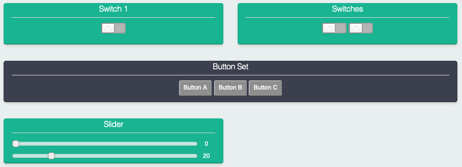
 panel1 = ESPUI.addControl(ControlType::Button, "Button Set", "Button A", ControlColor::Turquoise, Control::noParent, btncallback);
 ESPUI.addControl(ControlType::Button, "", "Button B", ControlColor::None, panel1, btncallback);
 ESPUI.addControl(ControlType::Button, "", "Button C", ControlColor::None, panel1, btncallback);
The first call to addControl has no parent (or it could be set to a tab if you are using a tabbed UI), so therefore a new panel is added containing one button
with the value Button A. The two subsequent calls have their parent set to the first control we added, so instead of creating
a new panel, the result is the following:
The grouped controls operate entirely independently, and can be assigned different callbacks, or updated separately. The grouping is purely visual.
Most controls can be grouped this way, but the result is not always visually pleasant. This works best with labels, sliders, switchers, and buttons.
If you group too many elements it might throw the layout of the rest of the UI out of line. Consider adding separators to correct this.
Advanced: Wide controls
Controls can be set to be displayed "wide" with the function:
ESPUI.setPanelWide(controlid, true);
Important! This function should be called before ESPUI.begin or results will be unreliable.
Setting a control to wide tells ESPUI to lay out that control as if there was only a single column, even on wide displays. This can be applied to every element to force a single column layout, or to individual elements to customise the display.
Note that this will have no effect on small screens.
Notes for Development
If you want to work on the HTML/CSS/JS files, do make changes in the data
directory. When you need to transfer that code to the ESP, run
tools/prepare_static_ui_sources.py -a (this script needs python3 with the
modules htmlmin, jsmin and csscompressor). This will generate a) minified files
next to the original files and b) the C header files in src that contain the minified and
gzipped HTML/CSS/JS data. Alternatively, you can specify the --source and --target arguments to the
prepare_static_ui_sources.py script (run the script without arguments for
help) if you want to use different locations.
If you don't have a python environment, you need to minify and gzip the HTML/CSS/JS files manually. I wrote a little useful jsfiddle for this, see here.
If you change something in HTML/CSS/JS and want to create a pull request, please do include the minified versions and corresponding C header files in your commits. (Do NOT commit all the minified versions for the non changed files)
Contribute
Liked this Library? You can support me by sending me a ☕ Coffee.
Otherwise I really welcome Pull Requests.


